Read Times +1 ()
How Maps Distort Our Perception of the World
Thanks Like 🧧 + ()
Summary
Maps can distort the way we view the world
Distorted Maps
The Earth is a three-dimensional sphere, and a map is merely its projection onto two dimensions, which inherently leads to distortion. If the word “distortion” doesn’t quite capture the idea, think of the effects applied to an image using tools like Photoshop.
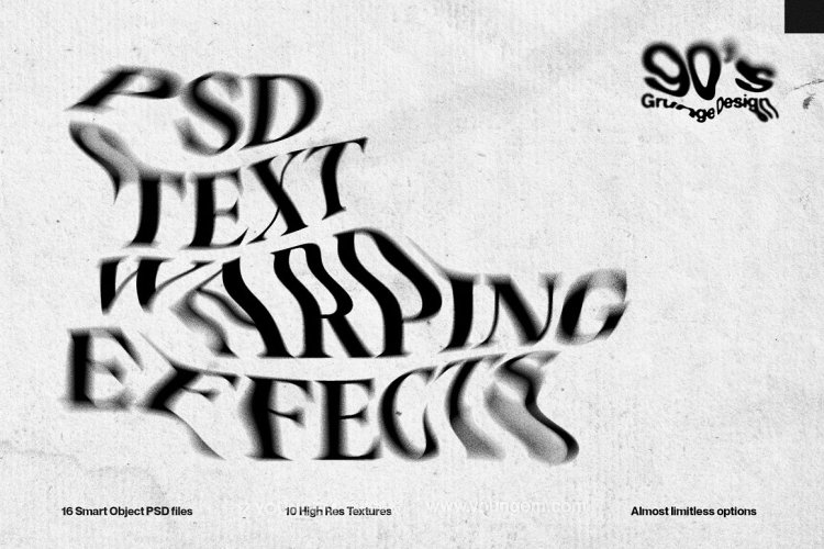
Now that we understand this concept, let’s take a look at the actual size comparison of countries:
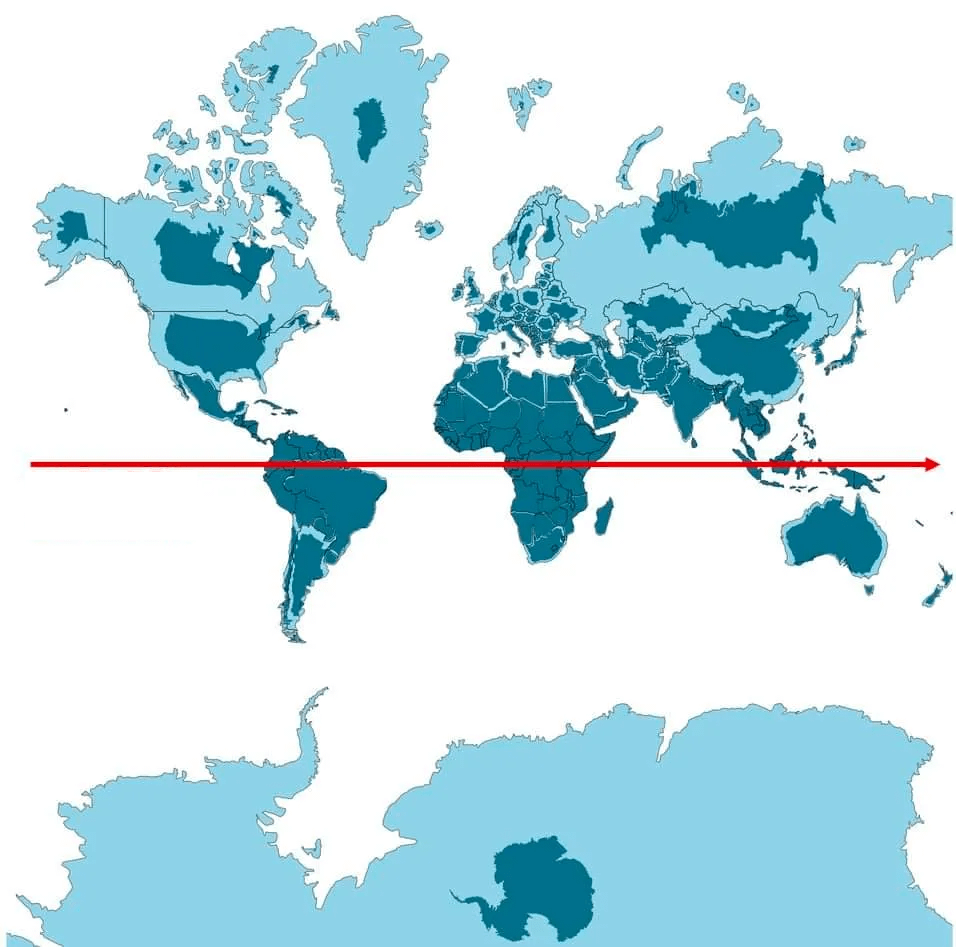
The red line represents the equator, and the dark shaded areas show the true size of countries when compared to those near the equator.
Using Africa as a reference, let’s see how the sizes of some major countries or regions compare:
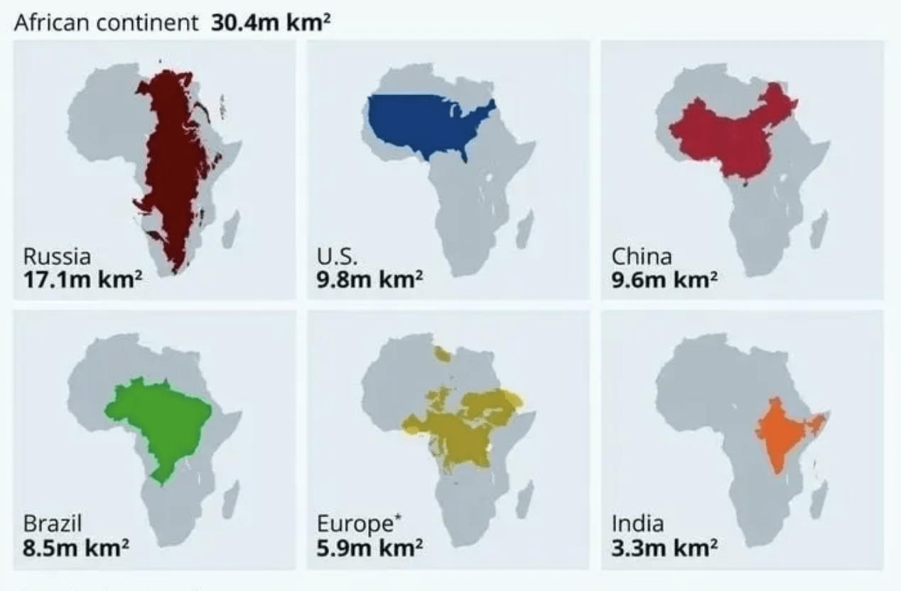
The gray area in the image represents Africa’s size, and the other colors represent the sizes of various countries. This chart might give you a new perspective on how large these countries are compared to Africa. Surprising, isn’t it?
Let’s try something fun: imagine fitting the areas of various countries/regions into Africa:
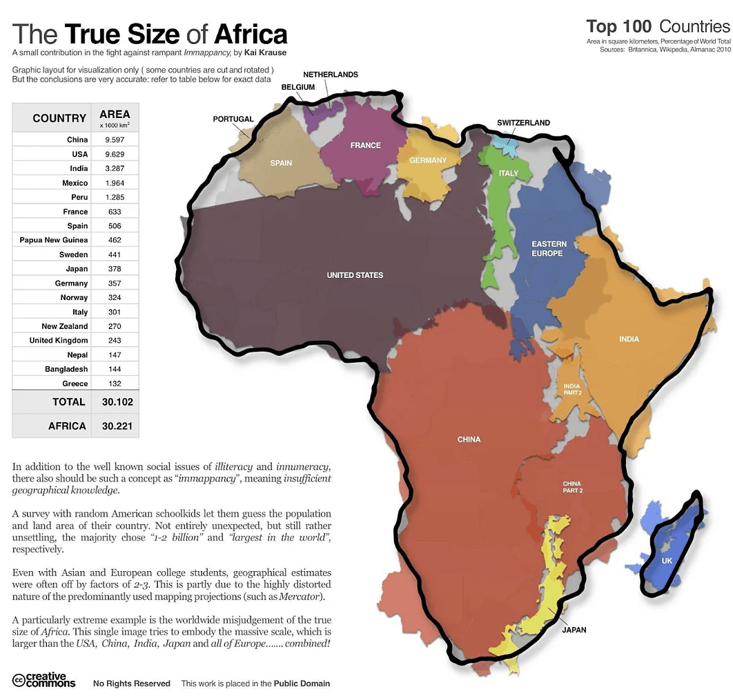
Interesting, right? The combined area of these regions is just about the size of Africa. Quite a coincidence, don’t you think?
Here’s another surprising fact: the width of Africa is the same as that of Russia.
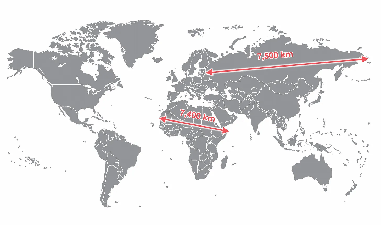
So, beware of those flattened globes in the future.
Maps from Different Perspectives
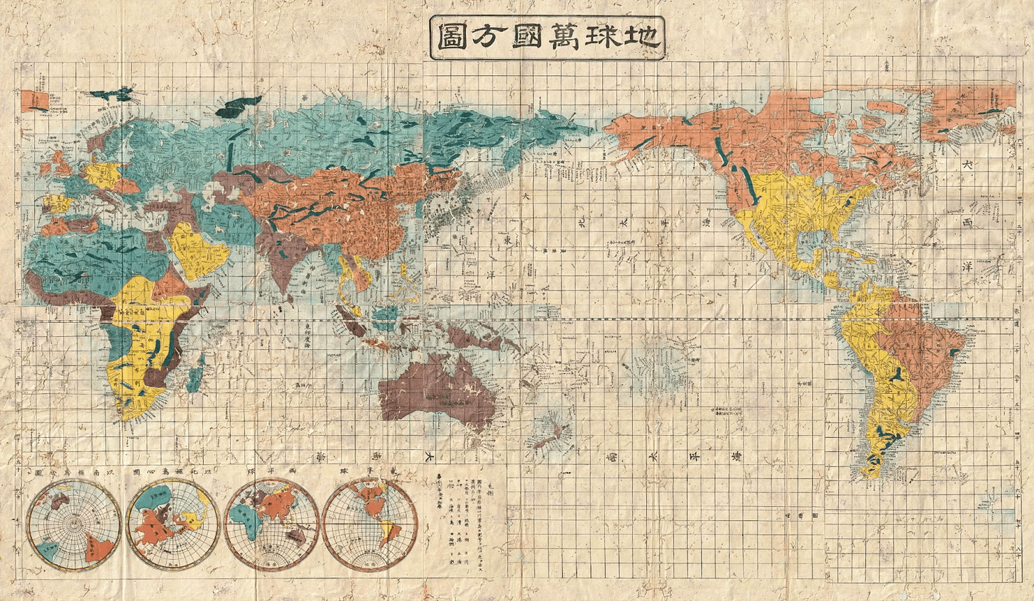
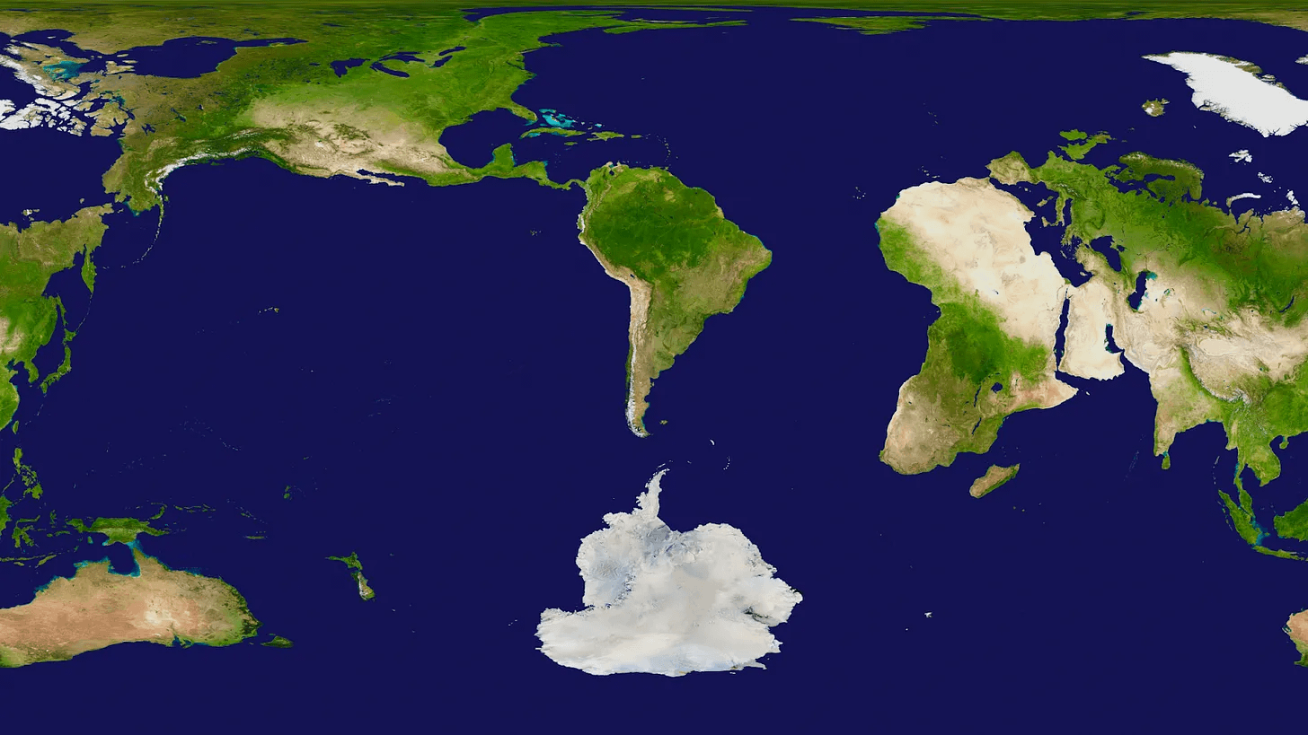
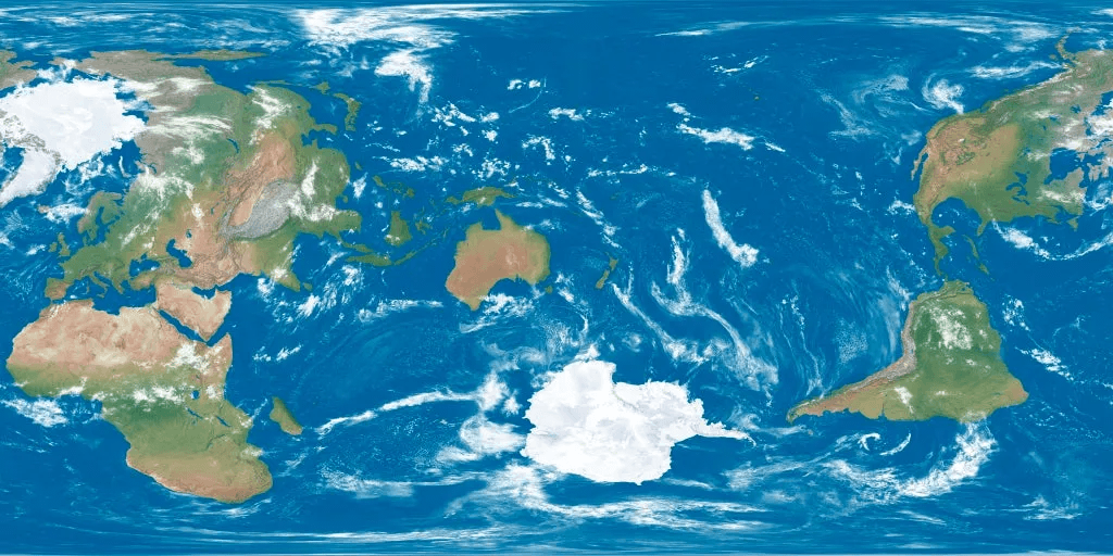
When creating maps, each country might consciously or unconsciously center itself. Let’s explore maps from the perspectives of different countries.
- Japan
- Argentina
- New Zealand
- Antarctica
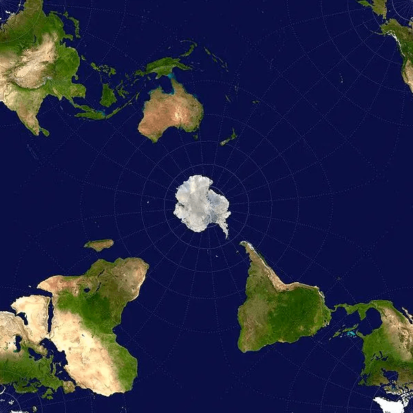
Interesting, isn’t it? Haha.